%20--%3e%3cpath%20d='M200.3,58.2c-2.5-2.5,1.1-6.8,3.3-4.2s-.9,6.5-3.3,4.2Z'/%3e%3ccircle%20cx='25.7'%20cy='49.3'%20r='2.4'/%3e%3cpath%20d='M87.2,63.9c0,0,.3.7.4.6,1.3-.9,3.4-4.2,4.8-4.4s3.2,1.2,2.8,3-5.6,5.5-6.7,7.5c0,.6,1.7,5.3,2.1,5.6,1.2,1.1,3.9-.8,4.7-1.8,3.4-4,6.1-10.1,8-15s2.1-6.4,3.6-9.4c-3.1-1.4-7.2-.7-9.7,1.5-1.5,1.2-3.2,4.4-5.3,1.5s3.2-6.2,5.3-7.2c3.8-1.8,7.7-1.6,11.7-.5,1.1-2,1.5-7.7,5-5.4s.3,4-.1,5.9-.2.4.1.6c4.3.7,9,2.7,13.1.6s2.2-1.9,3.2-3.8,3.1-2.4,4.2-.4-1.3,5.6-3.1,7c-5.8,4.8-12.8,2.4-19.4.9l-.4.2-5,13c-.6,2.2-.7,9.6.2,11.6,1.9,4.3,7.3-1.4,8.9-3.3s1.8-2.3,1.5-2.8c-4.3-2.6-4-10.8.9-12.5,5.7-2.1,7.3,4.9,5.7,9,2.6.3,8.2-5.3,10-1.8s-.5,2.6-1.1,4.1-1.6,6.5-.3,7.5,3.9-1.3,5.1-1.8c-.2-4.1,1.3-8.8,4.6-11.3s10-1.3,8.4,4.9-4.5,6.1-7.1,8.5c1.3.1,2.6-.7,3.6-1.5,3.5-2.8,8.1-10.8,12.4-11.6s4.6,2.9,4.8,5.3c2.4-4.9,8.9-7.6,12-1.8,2.3-2.8,6.2-5.7,9.6-2.9s0,10.1-1,14,0,.5.4.4c.8-.2,2.6-1.7,3.2-2.3,2.2-1.9,4.6-4.9,6.1-7.4s2.1-6.5,4.6-6c4.1.7.4,6.7-.2,9s-1.2,5.3,0,7.5c1.5.3,7.7-4.8,8.9-6.1s1.8-2,2-2.5c.6-1.2-.6-1.9-1.1-3-1-2.1-1.5-4.7-.2-6.8,1.9-3,5.7-2.3,7.1.8s.4,5.6.1,8.1l2.7,4.7c2.4-1.3,5.6-2.1,8.4-2.3s7.2-.3,8.5.8,1,3.6-1,4.1-5.2-.2-7.3,0-5.3.9-6,1.5,0,1.6.1,2.4c0,1.2.1,2.4-.4,3.5-1.8,3.4-7.4,3.1-8.4-.7s1-4.4,2.3-6.3l-1.5-3.1c-3.2,3.3-10.1,10.3-15.1,9.7s-4.5-3.5-4.4-6.2c-2.6,2.5-7.7,7.4-11.6,5.2s.7-11,.6-15.2c-.2-.2-2,1.2-2.2,1.4-2.3,2.1-3.8,5.4-5.1,8.2s-1.6,5-2.6,5.7c-1.7,1.2-3.5,0-3.8-1.9l2.7-9.7c0-.8.1-1.7,0-2.5s-.8-.4-1.3-.3c-3.3,1.2-5.8,10.8-7.8,13.5s-4.5,1.5-4.7-1,1.1-6.2,1.2-8.5,0-2.6,0-3.9c-4.6,3.6-9.4,13.2-16.1,12.5-1.4-.2-3-1.1-3.8-2.3-3.3,1.8-7.2,3.9-10.4.6s-2.2-6.1-1.8-9.1l-5.2,1.1c-2.7,4.8-9.3,12.9-15.6,10.4s-4.9-4.9-4.6-8c-2.1,2.5-3.3,5.3-6.4,6.7-5.4,2.5-9.1-.5-10.5-5.7-3.9,3.4-7.7,7.8-13.5,7.2s-3.9-1.6-5.3-3.2c-2.9,1.9-6.4,4.5-9.3,1.1s.8-12.1-1.1-16.6c-1.8-.3-5.1,6.4-5.9,7.8s-1.8,2.5-2.5,3.8-1.5,4.4-2.5,5c-1.4.9-4.2-.5-4.6-2.1l-.4-10.1-.5-3.6c-1.6,2.9-2.9,6-4.6,8.7s-5.9,8.3-8.6,9.1c-7.4,2.2-7.6-6.5-7.2-11.4s2.7-11.5,4.1-13.9,4-1.4,4.4.5-1.7,6-2.3,7.9-1.4,4.8-1.4,5.3v6.8l.4.4c.3,0,.6,0,.9,0,.9-.3,4.7-5.2,5.4-6.3,2.1-3.1,5.7-12.5,9.5-13.3,5.5-1.1,4.5,9.6,4.8,12.7l3.4-5.7c1.4-2.1,3.9-5.6,6.5-6,6.8-.9,6.6,7,6.4,11.6s-1.2,6.3-.3,6.4c.8-.1,4-2.2,4.2-2.8.4-.9.5-3.5.8-4.7,1.1-4.7,5.6-12.4,11.5-9.5s-.9,10.1-3.3,12.8-3.4,3.1-3.5,3.3c-.2.9,1.3,1.6,2.1,1.6,4,.2,8.5-5.3,11-8,.3-.7-.6-5.1-.6-6.4,0-2.1-.5-6.9,3-5.8s1.7,1.6,1.7,2.3c0,1.3-.2,3.3,0,4.5ZM70.8,68c.6-.2,2.9-3.5,2.7-3.7-1.4.6-2.5,2.3-2.7,3.7ZM142.8,70.2c.9-.1,3.4-3.5,3-4-1,0-3.4,3.4-3,4Z'/%3e%3c/svg%3e)
05. Strong Branding Is Not Necessarily More Expressive Branding
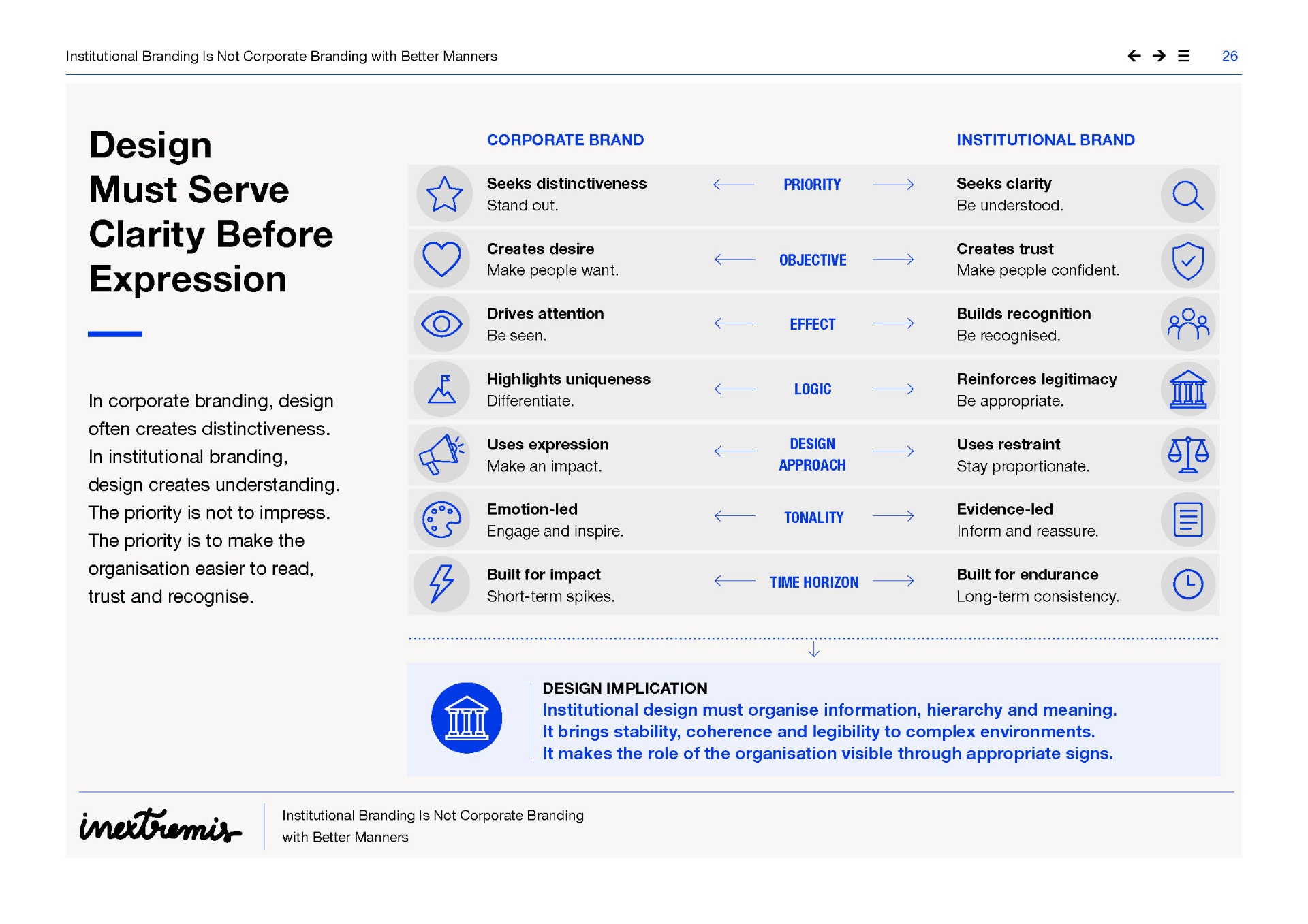
A strong institutional brand can be restrained, calm, rigorous, almost silent in certain contexts.
Here is one of the most persistent misunderstandings: many leaders believe that a stronger brand is necessarily a more expressive brand. More colour. More slogans. More emotion. More character. More impact. More presence.
In the corporate world, that intuition can make sense. A company must emerge in a saturated market. It must be recognised, preferred and remembered. Expressiveness can become a competitive asset.
But when applied directly to the institutional world, this intuition becomes risky. A European institution or association cannot simply seek to "stand out". It must also avoid appearing too self-centred, too promotional, too partisan, too emotional, too reductive or too seductive to remain credible.
A strong institutional brand can be restrained, calm, rigorous, almost silent in certain contexts.
Its power does not necessarily come from the volume of its expression. It comes from its ability to be recognised, understood, respected and correctly interpreted over time.
We therefore need to distinguish between three notions: Visibility makes the organisation appear. Expressiveness gives it character. Authority makes it credible. These three dimensions can reinforce each other, but they can also come into tension.
An institution can become more visible while losing authority. An association can become more expressive while blurring its representative role. A campaign can generate more engagement while weakening the perception of the organisation's seriousness.
In institutional branding, the right question is therefore not: how can we be more visible? It is: which signs genuinely strengthen our legitimacy?
The European Parliament's technical guidelines state that the logo is a fundamental element of visual recognition, that it must be visible and legible in communications to citizens, and that it is governed by precise rules on proportions, colours, typography, clear space, language versions and co-branding. The Commission also regulates the use of its logo by third parties in order to avoid confusion, uses that are incompatible with its objectives or the suggestion of unintended endorsement. These rules are not merely graphic precautions. They remind us that an institutional sign carries authority. An institutional logo is not only a shape. It is a marker of responsibility.
Institutional design must therefore work through appropriateness. It should not fill every space. It should not confuse energy with agitation. It should not replace clarity with effect. It must understand that the grid, hierarchy, white space, typography, repetition, stability of signatures and average quality of execution can create more strength than an accumulation of expressive signs.
Modernising an institutional brand does not mean making it louder. It means making it clearer, more coherent, more accessible, better adapted to contemporary uses, easier to deploy and more robust in real situations.
A brand can become more modern by becoming more legible on mobile, more stable in its publications, clearer in its levels of discourse, more accessible, more disciplined in its templates, more fluid in co-branding and more coherent in its campaigns. That may not look spectacular in a presentation committee. But it is far more transformative.
The danger is confusing modernisation with excessive simplification. Successful simplification clarifies complexity. Failed simplification erases the nuances from which the organisation draws its legitimacy.
For a European association, this risk is particularly strong. If its brand becomes too expressive, it may seem to speak more about itself than about the collective it represents. If it becomes too smooth, it loses substance. Good design must therefore find a demanding balance: distinctive enough to create presence, restrained enough to remain at the service of a collective voice.
A strong institutional brand is not the one with the most visible personality. It is the one whose personality is most appropriately governed.
Institutional creativity is not diminished creativity. It is more mature creativity. It does not seek effect for effect's sake. It seeks the right form.
What This Means in Practice
- ●Define an expression scale.
Some materials can be campaign-led and vivid; others should remain calm, formal and evidence-led.
- ●Use visual intensity deliberately.
Colour, image, illustration and motion should serve the situation, not become default decoration.
- ●Protect the master brand from visual inflation.
Do not create a new graphic universe every time a topic needs attention.
- ●Judge design by appropriateness.
The right question is not "does it stand out?", but "does this level of expression fit the role, audience and subject?"